Analysis of eSense data (CSV)
You can export the data from the eSense app and then further evaluate it with other programs (such as Microsoft Excel™ or Google Spreadsheets™). In this guide we will show you all the steps, from exporting from the eSense app to importing and evaluating in Microsoft Excel™ and Google Sheets™.
For the eSense Pulse we also have a complementary article about the Kubios HRV software.
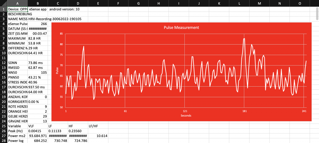
The examples shown in this guide are mostly related to the eSense Skin Response. In principle, however, data from the eSense Temperature, eSense Pulse, eSense Respiration or eSense Muscle can be processed in the same way.
Exporting measured values from the Mindfield eSense app
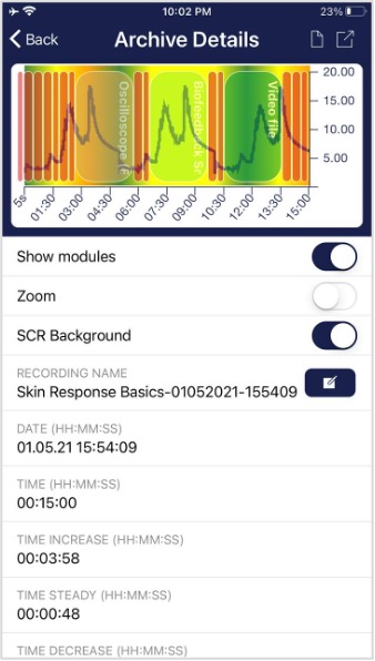
The app also includes an archive where you can save and export your recordings.
Export data
By tapping on the export icon in the upper right or by tapping the “Export as CSV File” button at the bottom you can export the recordings in .csv format with all common apps (e.g. send via Messenger™, WhatsApp™, email etc.) or simply on your phone or in your cloud (e.g. Google Drive™ or Dropbox™).
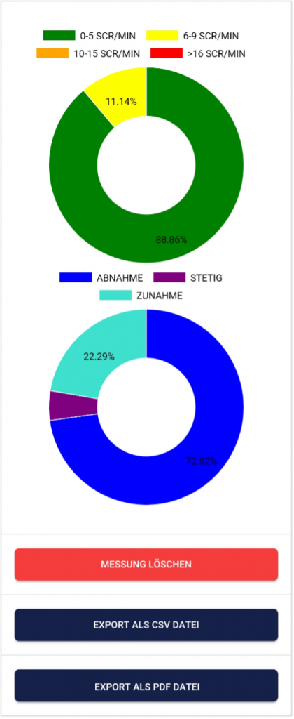
The data is exported as.csv file (comma-separated values). You can open this file format e.g. with Microsoft Excel™ or Open Office Calc™ (free alternative to Excel).
If you like working with Google, Google Sheets™ (Google Tabellen™ in German) can also be an alternative to Excel for you. You can also open and visualize your exported.csv files and easily access them from multiple devices via the cloud. Google Sheets has similar functions as Excel and a very similar operation.
General Note
The exported files are always CSV files. CSV stands for “Comma separated values”. This means that a comma separates the values in the file (,).
These CSV files can be opened and edited with programs such as Microsoft Excel™, Google Sheets™. It is also possible to import and edit with frequently used programming languages or frameworks such as R™, Python™, Numpy™ or Tensorflow™.
These instructions refer to Microsoft Excel™ and Google Sheets™. We recommend beginners to use Google Sheets™ rather than Microsoft Excel™, because it is easier to use and it often works better with our measurements (f.i. the seconds are not automatically prefixed to dates, see in the section on Excel). Google Sheets is also a bit better at quickly creating charts automatically. Using Excel makes more sense if you are already more familiar with Excel.
You can find Google Sheets™ here: https://www.google.com/sheets/about/
Your settings at Excel™ and Google Sheets™ are decisive. The eSense app adapts the measured values to the language used. In English, the numbers are usually separated by a dot. Therefore, 1.5 in the English version becomes 1,5 in the German version. So if you open the CSV file with Excel™ or Google Sheets™ and the numbers don’t make sense, it’s usually because of different languages in the eSense app and Excel™ or Sheets™.
In principle, therefore, the following applies: If you use Excel™ or Sheets™ in German, you should also use the eSense app in German. If you use Excel™ or Sheets™ in English, you should also use the eSense app in English. This saves you the first two steps (replacing decimal separators and splitting values into columns) and you can start directly with step 3 (Apply skin conductance against time).
Microsoft Excel™
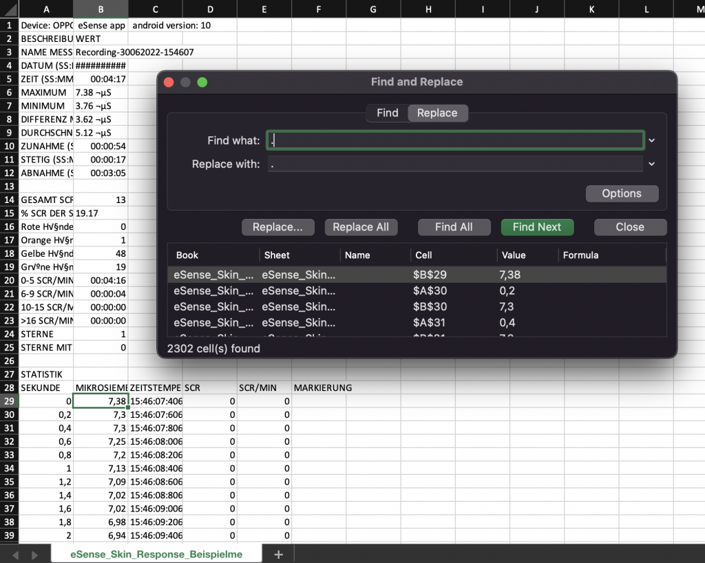
1. Replace decimal separator (only necessary if you have different language settings in Excel™ and the eSense app)
- Press Ctrl+H (search and replace).
- Replace all commas “,” with semicolons “;” (replace the column separator)
- Replace all commas “,” with periods “.” (replace decimal separator)
- (Alternatively, you can change the decimal separator used by Excel™ by default: Click File – Options – Advanced. Deactivate the item “Take over separator from operating system” and select dot as decimal separator and comma as thousand separator.
2. Split values into columns (only necessary if you have different language settings in Excel™ and the eSense app)
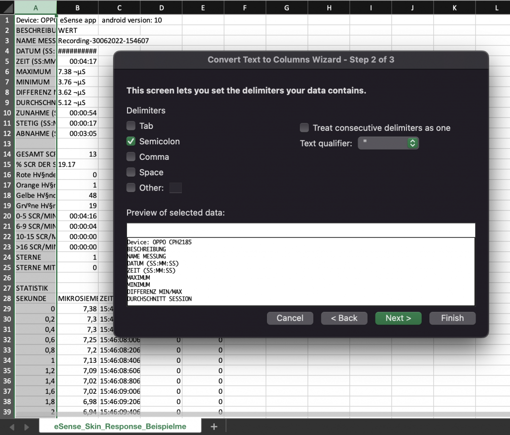
The values for time and measured value are still in the first column, separated by commas or semicolons. You must divide them into two columns.
- Select the entire first column A
- Click on the “Text to columns” function in the “Data” menu
- Select file type “separate” or “Delimited” and click on next.
- Choose the separator comma (,) or semicolon (;) depending on which character separates the values
- Click on “Next”, Column data format “General”, and “Finish”.
3. Format seconds correctly (optional)
Excel often formats the seconds in the first column automatically to a date. Unfortunately there is no way to disable this, it is preset by Excel. But there are a few ways to solve this: https://support.microsoft.com/en-us/office/stop-automatically-changing-numbers-to-dates-452bd2db-cc96-47d1-81e4-72cec11c4ed8
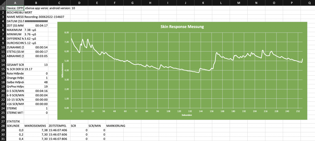
4. Draw skin conductance against time
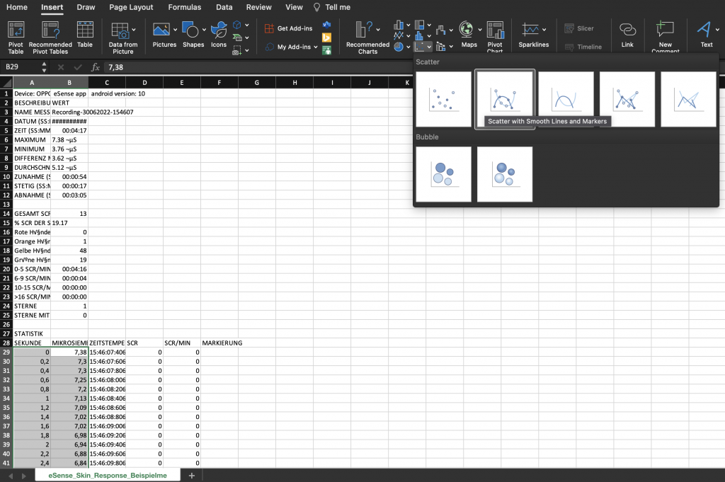
- Select both columns. The first column with the seconds and another column with the measured value depending on the eSense sensor (Microsiemens for Skin Response, Celsius/Fahrenheit for Temperature, heart rate or RR interval or HRV amplitude for Pulse, RR or breaths per minute for Respiration) completely. Then press the CTRL and Shift keys simultaneously, hold them down, press the left, and down arrow keys. With this abbreviation, you can quickly select both columns, even for thousands of measured values).
- Select the diagram type “Scatter” in the “Insert” menu and then the diagram type “Scatter with smooth lines and marker”. You get a diagram with the time in seconds in the horizontal axis. Alternatively, you can also select “Line”.
- Note: If you are using the latest version of Excel™, you can also try “Recommended graphs”. Often Excel™ already recognizes the graph automatically.
5. Draw skin conductance against markers
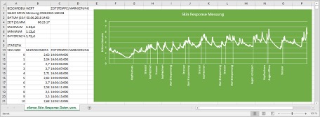
- First create the diagram from the previous step 3 (Draw skin conductance against time)
- In the menu under “Diagram tools” -> “Chart Design” select “Select data”. A new mask will appear.
- Under “Legend entries (rows)”, select “Add”.
- Enter a series name (for example “markings”) and select your markings for the row values (in column F)
- Select from the menu “Add chart element” -> “Data labels” -> “More data label options”.
- A menu will open on the right. There you can select “Label options” -> “Value from cells” (and deactivate “Value” if necessary). Another mask opens and you have to mark your marks from column D again.
- If you also want the lines to the positions in the graphs, you must select “Add chart element” -> “Drop Lines”
- You can now adjust colors or fonts.
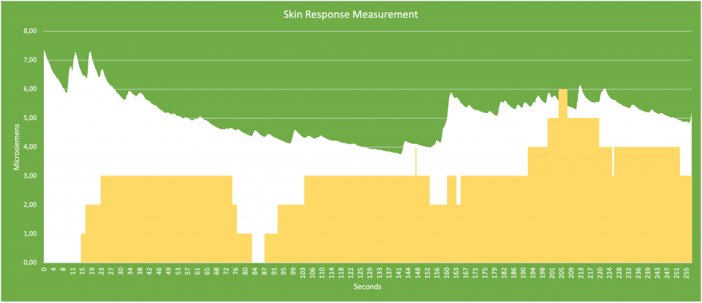
6. Draw skin conductance against SCR
- First create the diagram from the previous step 3 (Draw skin conductance against time)
- In the menu under “Diagram tools” -> “Chart Design” select “Select data”. A new mask will appear.
- Under “Legend entries (rows)”, select “Add”.
- Enter a series name (for example SCR”) and select your SCR/min for the row values (in column F)
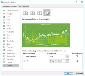
- In the menu under “Chart Tools” -> “Design” select “Change Chart Type”. A new mask will appear. In the tab, select “All Charts” -> “Combo” -> “Custom Combination”. For the SCR, select “Clustered Column” from the drop-down menu and make sure that the tick next to Secondary axis is set (see also following screenshot).
Google Drive (Google Sheets™, recommended)
As in Excel™, complications with the separators can also occur here. The exported files are always CSV files. CSV stands for “Comma separated values. This means that a comma separates the values in the file (,)
Google often tries to format the data automatically. Then it can happen, among other things, that the measured values are interpreted as date. To prevent this, you should first make sure that you select “Format” -> “Number” -> “Number”.
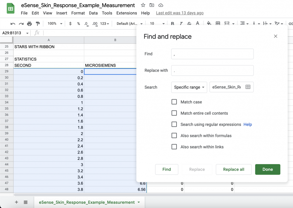
1. Replace decimal separator (only necessary if you have different language settings in Google Sheets™ and the eSense app)
- Press Ctrl+H (search and replace).
- Replace all commas “,” with semicolons “;” (replace the column separator)
- Replace all commas “,” with periods “.” (replace decimal separator)
2. Split values into columns (only necessary if you have different language settings in Google Sheets™ and the eSense app)
Depending on their language settings, the values for time and measured value are both in the first column, separated by commas or semicolons. You must divide them into two columns.
- Select the entire first column A
- Click on “Data” -> “Split text into columns” in the menu
- Choose the separator comma (,) or semicolon (;) depending on which character separates the values as seperator
3. Apply skin conductance against time.
- Mark both columns (Second and Micro Siemens/Celsius/Fahrenheit) completely
(Tip: click with the mouse into the column where “Measured values” is written. Then press the CTRL and Shift keys simultaneously, hold them down, press the left, and down arrow keys. With this abbreviation, you can quickly select both columns, even for thousands of measured values). - 4.3. Select “Insert” -> “Chart” in the menu. Note: Google Sheets™ often tries to automatically create the right chart. Sometimes this works well, sometimes it doesn’t. If the diagram does not make sense, simply continue with the next steps.
- Click on the diagram. A dialog box should open at the right margin. Select “Smoothed line chart” as the diagram type. For “X-axis”, make sure seconds are selected. For the “series”, make sure that your measured values are selected.
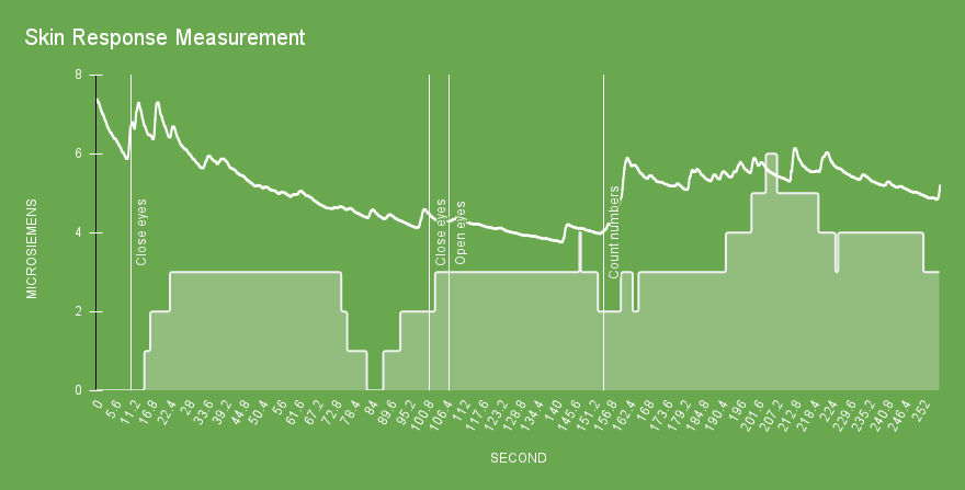
4. Enter main conductance against highlights
- Delete column C with the time stamp
- Mark the column with your measured values and the column with your markings simultaneously (as shown in the following screenshot)
- 4.3. Select “Insert” -> “Diagram” in the menu. -> „Diagramm“. Note: Google Sheets™ often tries to automatically create the right chart. Sometimes this works well, sometimes it doesn’t. If the diagram does not make sense, simply continue with the next steps.
- Click on the diagram. A dialog box should open at the right margin. Select “Smoothed line diagram” as the diagram type. For the “series”, make sure that your measured values are selected. Your markings should be selected as “Labelling”. See also the following screenshot:
The diagrams made via Google Sheets can also be embedded via iFrame.
Questions